TC Unlimited
Role
UX Researcher, UI/UX Designer,
Project Manager
Timeline
2 Weeks
Tools
Figma, Trello, Pen & Paper
This project was part of a 10 week UI/UX course at General Assembly.
What is TC Unlimited?
TC Unlimited is a boutique shop located in Philadelphia’s Garden District, Chestnut Hill. Established in 2005 as an online merchant, the first shop was opened in 2016.
Overview
The Challenge
Customers want to purchase from the store’s vast fashion collections, including their own original brand of activewear, but are having trouble navigating the site and finding specific items.
Through an improved website, I want to showcase the store’s products by labeling them into clear, concise categories and implementing features that will allow users to shop more efficiently and find what they need.
Contextual Inquiries
I started my research by conducting contextual inquiries with 4 participants to observe and identify the most prevalent issues users had while trying to add a jewelry item to their cart. I had my initial assumptions about the layout of the site and through these contextual inquiries, I was able to lay out the key findings that validated my initial assumptions.
What did I find?
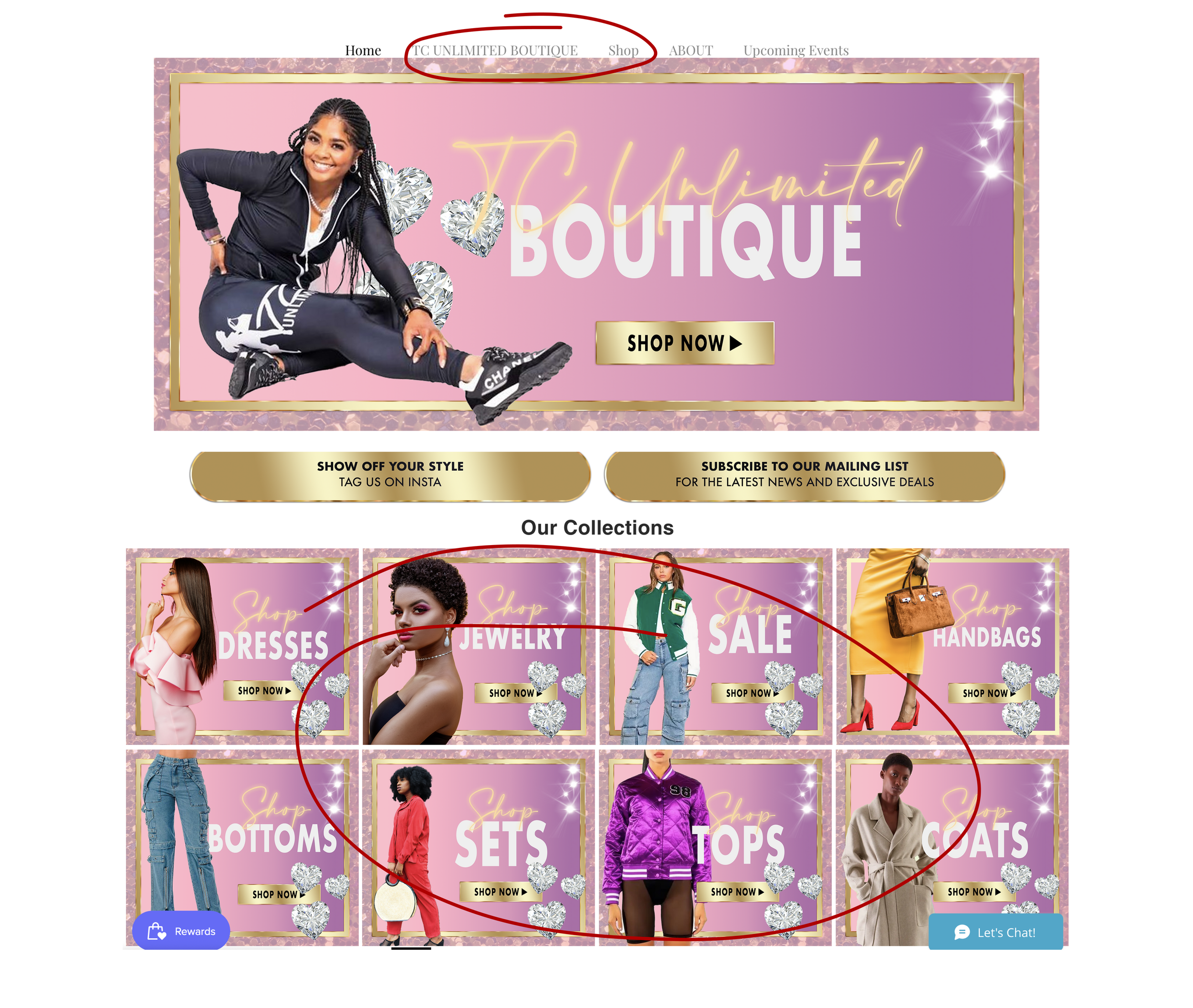
4 out of 4 participants were confused and overwhelmed by the home page, not knowing where to start to look for products
3 out of 4 participants were confused by the tabs TC Boutique and Shop as they listed similar items
3 out of 4 participants also had trouble locating items because they were not listed under the correct category
Primary Research
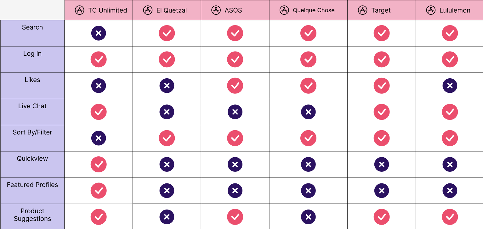
To better understand the market and identify key features for the redesign of TC Unlimited, I conducted competitive research
My indirect competitors are Target, Sephora and Lululemon as they are all major retailers who organize their products in different, yet efficient ways.
My direct competitors were ASOS, and two local businesses, El Quetzal and Quelque Chose which are fashion retailers who sell similar items
I gathered the data from the competitive research and created a feature inventory to identify features that could be incorporated to benefit TC Unlimited and fulfill the user’s needs and goals.
Researching Competitors
User Flow
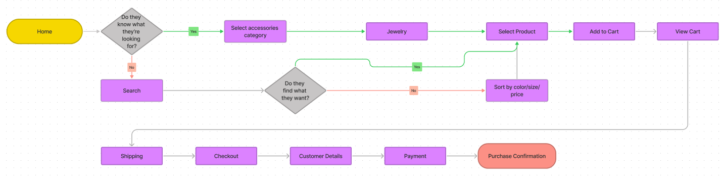
After identifying the main pain points and goals of the user, I created a user flow to show the step by step process of how they might navigate the site, addressing the needs of the user to provide a worthy solution to their problem: being able to quickly and easily locate items to purchase.
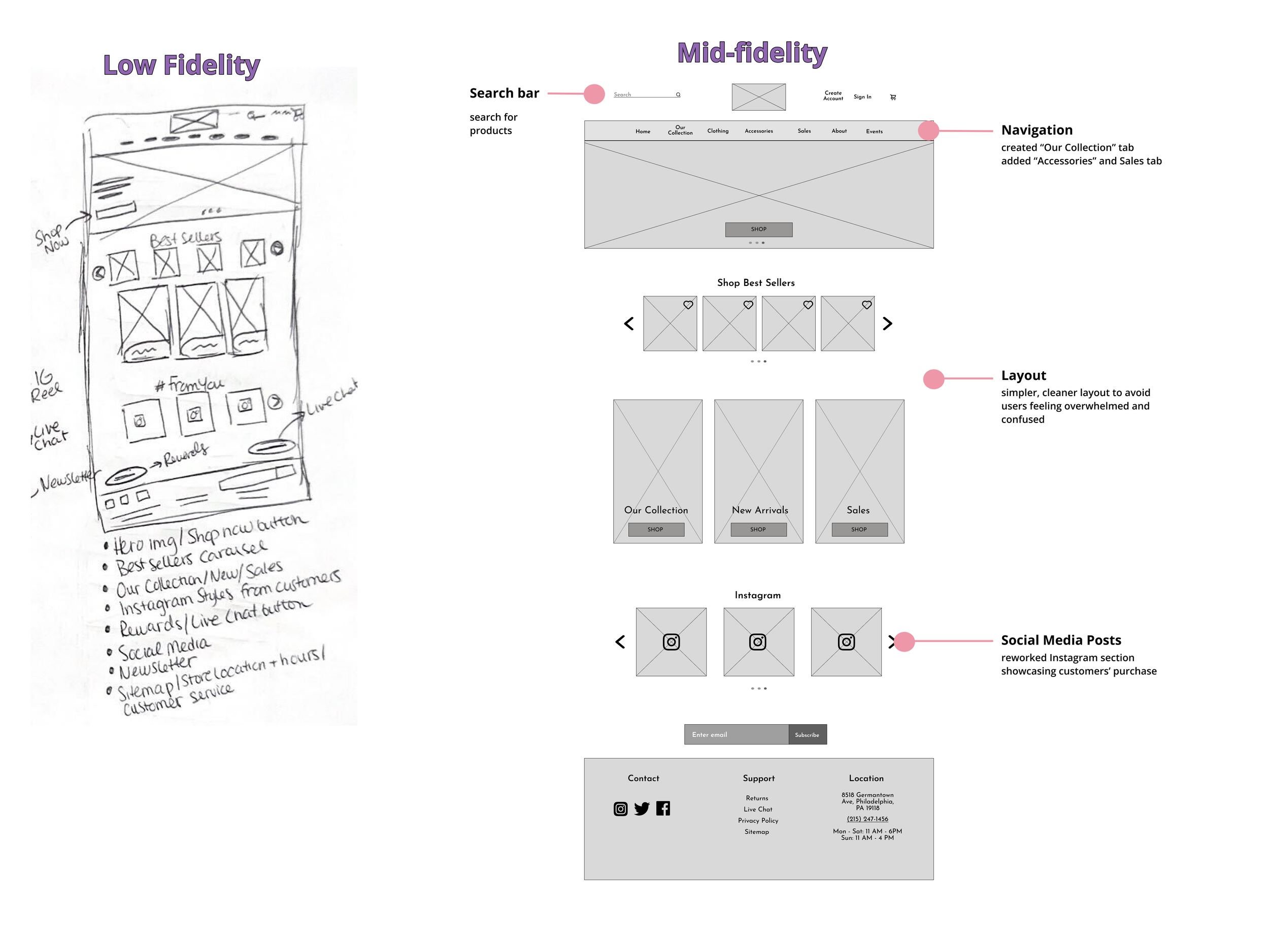
To kickstart the design process, I sketched multiple iterations of the homepage to brainstorm and generate ideas for what the redesign of the site may look like. After various iterations, I settled on my final homepage sketch and later translated it into a mid-fidelity home screen through Figma.
Ideating Solutions
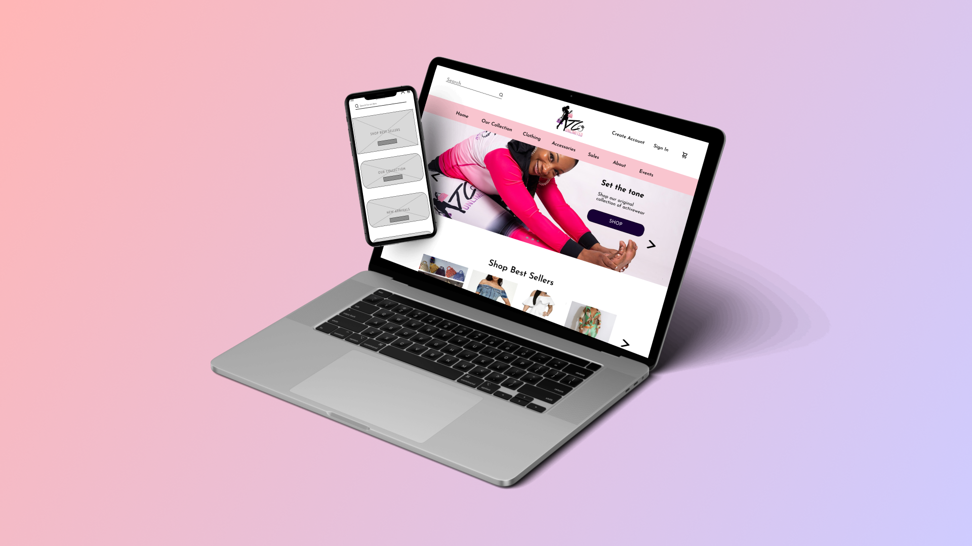
From my sketches, I created mid fidelity wireframes using Figma to more accurately define UI elements and showcase key features my proposed solution to providing an easy shopping experience.
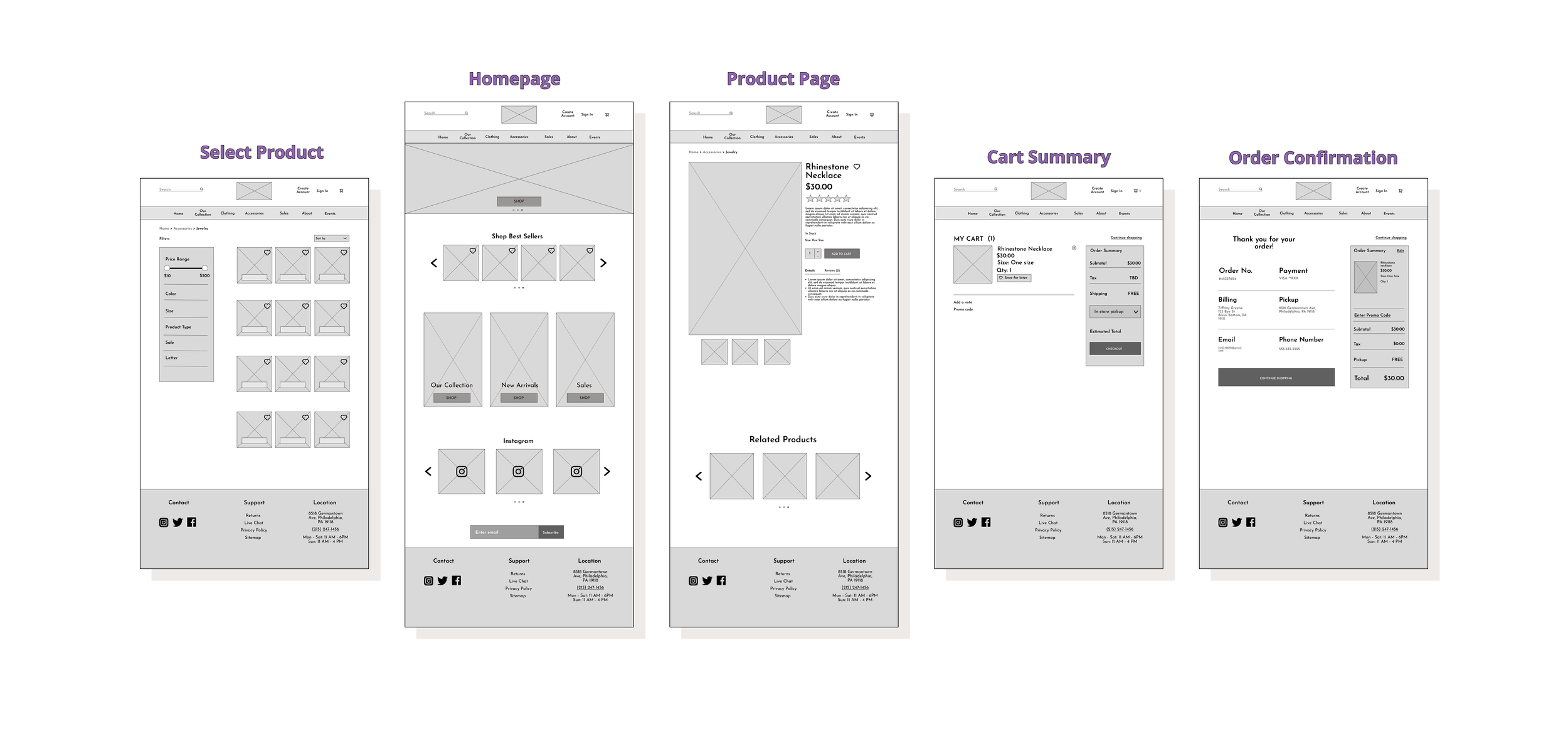
Wireframes
Usability Tests
Using Figma, I created a mid fidelity, clickable prototype to test the efficacy of my design solution. I tested this prototype with 7 participants remotely.
What did I find?
Users were all able to easily navigate and locate products
57% of users had trouble knowing where to select an item
Users valued the smooth and seamless process
What have I learned from this project?
Redesigning TC Unlimited’s website was such a great learning experience. The process really allowed me to better understand each research method and when to best use the many different types.
User research is immensely important throughout the entire process. Without the participants and their feedback, I wouldn’t have been able to create the right design solutions that would benefit the user.
Next Steps:
In the future, I plan to:
Build a fully interactive, high fidelity prototype for the website
Continue testing and iterating on designs to hone in more on branding